
There are many kinds of web design approaches and focuses. Every web designer or developer has their strengths and tendencies, but some designs take the main precedence or can become “popular” for that year, and so on. Each one aims to cater to the owner or user’s needs in a different fashion.
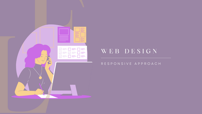
A responsive web design approach focuses on how the website will appear across devices. Specifically, a responsive web design “aims to make web pages render well on a variety of devices and window or screen sizes from minimum to maximum display size to ensure usability and satisfaction” (Wikipedia). Simply put, the core driver of those utilizing a responsive web design is adaptability in the website’s design that will allow it to morph to the screen of whatever it is viewed on. This design is advantageous, especially in today’s world where some visitors check out a website on their mobile devices (which has its own range of screen size and functionality) or on the desktop (once again with variations in screen size and browsers). Not only is the web design adjusting, but all the components within the webpage adjust as well. You can see the difference in layout or where some buttons appear.
There are advantages and disadvantages to this web design approach like all others.
A few benefits are:
-
Improved user experience
-
Improved visibility
-
Quicker Site Speed Loading
To get into each point a bit further, there can be an improved user experience because the design will adjust based on where and how the user is visiting the website. If a responsive design isn’t utilized, then there can be print cut-offs or buttons in awkward places because the website was only designed for a desktop or mobile solely. There is no way to be assured a visitor will only visit your site on a specific kind of device so this will present a bad first impression for some users if they visit a device the website wasn’t designed for. This tends to improve visibility because as mentioned above, the components of the website will adjust with the device. Therefore pictures will shrink to fit on the page and text won’t be cut off by the sides of a mobile device, whereas on a desktop the pictures won’t be tiny and the text won’t be solely on one side of the screen. There can be quicker site speed loading because the website will load based on the device.
A few disadvantages or components to be aware of:
-
Not fully optimized
-
Can have slower performances
-
Potential usability issues
A few issues are that the website won’t be fully optimized for any particular device. It will neither be completely mobile-friendly nor desktop, but instead somewhere in between. There can also be slower performances due to file size. If files aren’t properly adjusted, they will load slower on a mobile device whereas they would load fine on a desktop. The biggest potential pitfall is usability. Someone who is visiting a website often has different intentions in what they want to do on the website than a desktop visitor. This can be interacting with the site through buttons but also relate to reading. If there is a lot of written content on a site, someone scrolling may bounce quicker on a mobile device versus on their desktop.
Conclusion
When designing a website, there are a few approaches that will impact where the focus or emphasis is for your website. One of these website design approaches is a responsive design. Responsive designs are beneficial for websites nowadays because more and more people are accessing content while on the move (from more Wifi locations to mobile data users). To ensure you have the best presentation across devices, being responsive is important. However, it is important to know that this approach will have aspects of web design it will overlook. To ensure these weaker points of the approach don’t become a limitation or a causer for visitors to leave, it is vital to be aware of them and keep them in mind when reviewing the finished product.
References:
-
https://en.wikipedia.org/wiki/Responsive_web_design
-
https://sympli.io/blog/benefits-and-fundamentals-of-responsive-web-design
-
https://www.digivate.com/blog/mobile/responsive-web-design-dedicated-mobile-site-or-mobile-app/